Tag Archives: Living Room

‘Round Here

Happy Friday!  It’s still rainy around here, so the light is not the best, but below are a few shots around the house these days.  Seasonal decorating is such a challenge for me.  I don’t want to get too kitchy, but with a 4 year old who loves to help decorate, I want the house to remain playful and fun, especially for Halloween, which was one of my favorite holidays as a kid.  So, I tried to incorporate a lot of brown, orange and black with some kid-friendly touches.  Oh, and if you make it to the bottom, there is a little bonus sneak peek of the nursery paint….

{Corner of the mantle}

{Living room}

{Front hall console}

{Dining room}

{Corner of the family room}

{Front door.  Need Pumpkins!}

{Painted nursery.  Mentally remove the mess and insert better lighting!}

Have a happy Fall weekend!

An Open Letter to Rachel Zoe

Dear Rach:

Rachel Zoe is beand ambassador for Exude lipstick

I love your show and happen to think that you are BANANAS.  Your fashion styling is impeccable, spot-on and always uber fashion forward.  However, your interior styling needs some serious help.  I die, literally. 


I know you put a lot of stock in your new assistant, Jeremiah Brent, who has some interior design experience, and I agree that he is adorbs to look at, but lemme tell ya, hmm how to say this, umm well…HE SUCKS. 

I know he was under a time deadline and you and Rodge love clean, white and glam, but he HAD NO BUDGET, and this is the best he could come up with for your dining room?   

No rug, no fabric, a builder’s light fixture.  Really?  YAAAAAAAAAAWN.

May I suggest….

Which is still white and black with pops of yellow, but is way more glam, warm, and sophisticated and not THAT complicated.  Bloggers DIY floors like that everyday.  See what I mean, girlfriend?

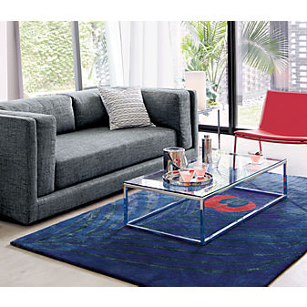
Moving on to your living room.  Le sigh.  It has some nice features like the tufted sofa with nailhead trim, but the lamps are the wrong scale and look straight out of Homegoods.  And I happen to detest the overgrown bean bag chairs, SO. NOT. GLAM.  Are window treatments too much to ask for? 

How about this?  Which is way more sophisticated, not THAT complex, yet still simple and chic….

And finally, the library/ study.  Sweetie, this is just plain sad.  Couldn’t Jeremiah find more furniture for the room?  Shoot, head on over to Ikea.  The bookshelf styling, well, isn’t.  This room needs some oooomph, like stat. 

You need something like this where you can relax, read your fashion mags and gossip with Kate Hudson:

Clean, bright, warm, functional, simple, inviting. 

So, Rachie-poo, as cute as he is, Jeremiah ain’t cut out for interior design.  Call me.  We’ll chat and get you pointed in the right direction.  In no time, your house will be EVERYTHING.  But I can’t promise that I will get along with Joey and Rodge — they are serious divas.

xxoo, ada

P.S. I miss Brad.  Like, a lot.

{To see more pics of RZ’s digs, go to Bravo TV.
Photo credits: 1. People Magazine, 2. Casa Sugar, 3. Casa Sugar, 4.  Pinterest, 5. Casa Sugar, 6. Skye Kirby, Elle Decor , 7. Casa Sugar, 8. Here}


Living Room Update

Thank you all so much for all of your kind comments on yesterday’s post.   You are all so sweet.  They made my week! 

Today, I am sharing recent updates to my living room.  This is a strange room in the front of our house that doesn’t get used much, but hopefully that will change.  When we first moved in, I used it as my office, but after Clare arrived and she spent half of the day downstairs with the baby-sitter, I knew this wasn’t going to work.

{I can’t believe I found this picture!  It’s c.2006 and way pre-blog.  Do you spy the old-school blue blackberry on the right side of the desk?} 

 Since Clare came along, it’s been a “living room” filled with a random assortment of orphan items that didn’t really flow together, including that fair isle rug.  I can’t find a picture of the living room set-up, and didn’t even want to take a “before” shot!  I am hoping to turn it into more of a “Mom Cave”  and use it for reading and chatting on the phone away from the hubbub of the rest of the house.  🙂  Sounds luxurious, right? 

For my birthday in May, my husband got me the gorgeous “Blues Comes Through” print by Alice Dalton Brown pictured below (that I have been coveting for a while and blogged about in August of last year).  The old decor clashed with my beloved print.

Based on what I already have, I am going with a color palate of light blue, yellow, white and seagrass.

So far, I have updated the room with Ballard Designs’ Seagrass Rug and replaced the old pillow covers with the light blue Jute Braid Pillow Covers from Pottery Barn.     

I like how the long, rectangular rug makes the room appear bigger.  The previous rug (a 5 foot circular rug above) made the room appear much smaller. 

I replaced a red/white/green framed Georgia O’Keefe poster with this framed illustration from our family room.  And I already had these pillows from Target (which are ubiquitous in the blog world!) and the throw blanket from West Elm, which was also in the family room.

In the short term, I would like to: 1. replace the dark blue pillows on the long couch with a pair of these:

ONE new 18x18 multi color, red, turquoise, green, gold, ikat, medallion, pillow cover, throw pillow,  decorative pillow SHIPS WITHIN 24 hrs

2. Purchase a small and light coffee table, preferably thrifted, but I also like the look of this one from CB2:

and 3. Style the bookcase with some interesting and fun pieces and books. 

Longer term, I would like to replace the end tables with some that add some  height to either side of the long couch.  I would also love to add a fun chandelier or lantern and some airy, flowy curtain panels. 

I am resisting the strong urge to make this room too beachy or coastal, which would be easy to do given its colors and current elements.  However, I don’t live at the beach or in a coastal town and that decor would NOT match with the rest of the house, so I am staying away from seashells, capiz, coral, etc.!

So what do you think?  Any good ideas for me?

Next up, I will share an update on one of my New Years Design Resolutions!

Styling with Minimal Commitment

{I found this image on Pinterest — do you Pinterest?  If not, you don’t know what you are missing!  If so, come follow me: http://pinterest.com/adamarie/.}

Anyway, in my opinion, the styling in this living room is genius.  This look would be perfect for a renter who needs to keep the walls white and doesn’t want to commit to an expensive design aesthetic.  The individual pices are so versatile — a white twill love seat, a gorgeous gourd lamp, that amazing purple ikat chair (which makes a HUGE statement, but can be recovered at a moment’s notice), and simple side and cocktail tables.  I love that nothing matches perfectly, but everything works together.  Oh, and those fish prints could easily be printed from the New York Public Library’s Digital Gallery and popped into gallery frames from Wal-Mart. 

 I like this guy

I am a big fan of commitment-free styling because I love to move everything around and try new things in different spaces, so I try to buy really versatile pieces that can be used easily in another room. 

J. Lo’s Gorgeous California Home

Jennifer Lopez’s house featured by Veranda is stunning.  Surprisingly so.  It has an amazingly understated glamour and elegance. 

I start with this image because it’s the entrance to the home, although it’s not my favorite part of the house.  I love the wide runner on the curved staircase and the light blue couch, but I would do away with the fluffy wheat sheaves/feathery things next to the couch and add a more impactful piece of art
at the top of the steps.

I love this serene kitchen with the beautiful soft blue cabinets, pristine marble counters and gooseneck faucets.

The unexpected light fixture is perfect.  Great table and nailhead trim on the chairs.  Oh, and I love the styling — cupcakes, yes please!

The furniture placement in the family room is brilliant.  I love the use of chaises with those gorgeous mink pillows.  I would enjoy a punch of color in this room, maybe magenta or even a brighter blue like turquoise or teal.

This dining room is perfection: the luxurious wallpaper, the tufted chairs, the glamorous crystal chandelier, the pop of red and green from the calla lilies and peonies (?), and the ethereal window panels.  Ooooh and aaaaah.

Below is my favorite image — I love the whimsy of the flamingoes, the simple art  layered on top of that amazing wallpaper and the pretty styling of the lucite console. 

Can you believe that this is J.Lo’s house?  It’s a far cry from what I would expect to see from her on MTV’s Cribs (remember that show?).  Don’t be fooled by the rocks that she’s got, she’s still, she’s still Jenny from the Block….

A Cozy Cape

I am loving the new spreads in Veranda magazine since Dara Caponigro (of Domino fame) took the helm as the mag’s Editor-in-Chief.  Dara and her team hit it outta the park with this pictorial on an amazing cottage renovation on Cape Cod. 

{I love the double decker porches and the natural landscape.  I spy an outdoor shower too!}

{Ok, you all know me, I am a sucker for flags as art, and especially at the beach.}

{IMHO, this is a little too Pottery-Barn beachy-matchy, but I included the picture because I love the color of the walls and the contrast with the crisp white wainscoting below.}

{The owner/designer used local beach stones on the fireplace.  Loves!  Also, the use of driftwood as the mantel was brilliant.}

{Great casual eating area.  A great example of how wood finishes don’t have to match to look fab (e.g., white table with natural chairs).}

{I like the simplicity of this bedroom.  The built-ins are drool-worthy and I am coveting the Schoolhouse Electric pendant and Dash and Albert rug.}

{Doesn’t your laundry room look like this?  Matching monogrammed Bean totes and all?}

Images courtesy of Veranda, click here to see the whole story;
Designed by Meredith Hutchison; Photos by Tria Giovan.

Runway to Rooms

It’s been a long while since I have done a “Runway to Rooms” post.  I have been coveting these amazing Suzani-inspired Lilly Pulitzer sun dresses all summer, and a beautiful room to match would be the best accessory!

RUNWAY….

TO ROOM.


RUNWAY….

TO ROOM.

(Photo Information: 1 & 3) Lilly Pulitzer Bowen Dress, $268 in Island Coral and Bright Navy, 2) Southern Accents via Apartment Therapy, Photo by Pieter Estersohn, Design by Amelia Handegan, 4) House Beautiful, Photo by Reed Davis, Design by Moises Esquenazi.)


The One Room Challenge, Part II

Last week, I posted the one room that summed up my style in response to Ally’s “What’s Your Style in One Room?” challenge.

As I mentioned, it was SO HARD to choose one room and as promised, here are my many runner-ups:

{I love the white bedding, pops of orange and lots of natural light.}

{Again, more white, pops of color (this time turquoise) and lots of light!}

{Gorgeous white washed floors and lots of different textures.}

{Hmm, I am sensing a pattern, white bedding, pop of color and lots of light!}

{Am I that predictable?}

{Apparently so.}

{Oh jeez, this is getting embarrassing.}

{Like, really embarrassing.}

But seriously, these rooms are my drug of choice.  Perfection!

And here are a few of my faves from the other participants in the challenge:

{Ally’s fave from the challenge in summer 2009}

{Image chosen by  Decor Happy, credit: Atlanta Homes and Lifestyles}

{Image Chosen by Lillies of the Field, credit: Jon Jensen Photography via Black*Eiffel}

{Image Chosen by My Dream Canvas, credit: Traditional Home}

Wasn’t this fun?  Thanks again to Ally at From the Right Bank for this challenge!

Image credits: 1. House Beautiful, 2. My Home Ideas, 3. Ohdeedoh, 4. Live Like You, 5. With Two Cats via A Few of My Favorite Things, 6. Southern Living, 7. House Beautiful, 8. Southern Living, 9. Can’t find source!}

Design Crush: Skye Kirby

I fell in love with Skye Kirby’s design aesthetic while leafing through thie month’s issue of Traditional Home.  May we have a moment of silence for one of the most perfect rooms ever?

I wish that Traditional Home had the digital image of the sweeping view featured in the magazine.  I love the soothing colors, the symmetry, the layers, the casual yet refined vibe, her choice of artwork, the sisal rug and the floor cushions…I could go on and on.  This project was designed for the pool house for the 2009 Hampton Desigher Showhouse.  Skye (I feel like we should be on a first name basis!) envisioned this space as a summer studio for an artistic couple. 

So, I searched high and low for more rooms designed by my BFF Skye.  Here is what I found (I hope you are sitting down!):

Holy gorgeousness!  In addition to being a kick-butt designer, Skye is the vice president of stores and marketing for Lillian August.  I absolutely love her work and can’t wait to see more! 

I will leave you with one of Skye’s 10 “Must Have” design elements that I really identify (and struggle) with: “Over-accessorizing can take away from the calming nature of a room and become distracting.”  Loves!

{Image Credits: 1. Design My Way, 2. Can’t Find Source, 3. Elle Decor, 4. DecorPad, 5. Elle Decor, 6. Elle Decor, 7. Can’t Find Source, 8. Elle Decor, 9. Elle Decor}

Dreaming of a Vacation

Won’t you join me?


{All images courtesy of Coastal Living}